

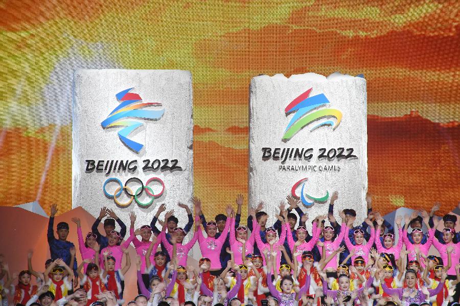
The emblem (L) of Beijing 2022 Olympic Winter Games and emblem of Beijing 2022 Paralympic Winter Games are seen during the emblem launch ceremony for the Beijing 2022 Olympic and Paralympic Winter Games in Bejing, capital of China, Dec. 15, 2017. (Xinhua/Ju Huanzong)
BEIJING, Dec. 15 (Xinhua) -- Named "Winter Dream" and "Flying High," the emblems of the 2022 Beijing Olympic and Paralympic Winter Games have again left a Chinese mark in the history of the Olympic and Paralympic Games, following Beijing 2008 and Nanjing 2014.
The two emblems were officially launched in the National Aquatics Center, known as the "Water Cube," on Friday.
Lin Cunzhen, deputy dean of China Central Academy of Fine Arts' Design School, is the designer of the two emblems.
She is a designer already closely tied with the Olympics, having also designed the emblem of the Nanjing 2014 Youth Olympic Games.
"After I knew my design finally got approved, my first feeling was of total relief. We've finally made it, and I felt a great sense of accomplishment. I'm really excited," said Lin, who has worked on these emblems for a year.
"I would say that every time we made changes, we did research, made revision and went with the best things. I learned quite a lot during this process," she said.
In 2014, Lin's design was adopted as the Beijing 2022 bid emblem. Now, her designs have again been selected as the final emblems of the 2022 Beijing Olympic and Paralympic Winter Games.
With its origin in the Chinese character "dong" (winter), the Olympic emblem integrates the spirit of Chinese calligraphy and eastern cultural heritage with a modern, global style.
It represents a new image of and dream for China. It also expresses China's vision and determination to host "a fantastic, extraordinary and excellent" Winter Olympics and Paralympics, and to encourage 300 million people in the country to participate in winter sports. At the top of the emblem is a skater rushing forward, while at the bottom is a skier. The dynamic lines in the middle represent the mountains and trails in the snow seen during winter sports, and the silk ribbons which are often used when Chinese people celebrate the Lunar New Year, which will overlap with Beijing 2022.
The Paralympic emblem, featuring an athlete-centered concept, also combines Chinese calligraphy and Paralympic winter sports. Oriented around the Chinese character "fei" (flight), the emblem is an abstract image of an athlete who is fighting for victory, highlighting the spirit of and inspiration for the Paralympic Winter Games.
"The Olympic emblem was initially drawn on the idea of the Chinese character 'dong' (winter) in the bid emblem, with the character rendered in Chinese calligraphy representing Chinese culture. Meanwhile, a pattern combining ice-sports and snow-sports was used to represent the Olympic Games," Lin said.
"The design was guided by the athlete-centered concept of the Games. The questions we had to ask ourselves were these: How to make it different from the bid emblem and how to showcase the athlete-centered concept? Those required a lot of research. As the Winter Games have both ice sports and snow sports, the emblem has to be an abstract expression of both."
Last December, after rounds of selection, Lin's design, No. 801 in the system used by the emblem review committee, emerged from a total of 4,506 designs submitted from all over the world.
But the joy of triumph was soon displaced by the need to undertake intensive revision work. Lin said she and a group from the China Central Academy of Fine Arts had made the revisions repeatedly from January to November, and there were occasions when she was pushed onto the verge of collapse.
"When you have to restart over and over again, you turn numb to things like graphics," Lin said.
However, Lin did not give up. In a small office at China Central Academy of Fine Arts, she led her team to have in-depth discussions with experts. Together, they continuously readjusted their designs.
Lin worked like crazy for quite some time, according to her students. Lin said she was truly delighted to see every, incremental improvement of her designs.
"People always ask me where the inspiration comes from, but I think design needs to be down-to-earth. Sometimes inspiration occurs, but for most of the time, you have to revise your design little by little and make it closer to perfect," she said.
Compared with the design for "Winter Dream," the design of the emblem "Flying High" posed even greater challenges for Lin.
"How to make the two emblems related, but distinct? The emblem for the Paralympics should communicate the identity of the Paralympics. It took me a very long time to think it over," she recalled.
Lin said following the idea of designing the "Winter Dream" logo, she tried many times to look for a Chinese character that could be featured in the emblem "Flying High."
"We tried many characters, such as 'fei' (flight), 'meng' (dream), 'mei' (beauty) and 'xin' (heart). But when they were put together with 'dong,' people would read them together and have new interpretations. We tried to avoid that."
To find an idea, Lin began to watch videos and pictures of previous Paralympic Winter Games. Finally, she decided to use an abstract pattern instead of a character.
"The final version of the Paralympic emblem 'Flying High' comes from the Chinese character 'fei' (flight), but it changes into the character for sports as the emblem showcases both the inner strength and the fast speeds achieved by Paralympic athletes," said Lin.